

Case Study:
INFORMATION ARCHITECT
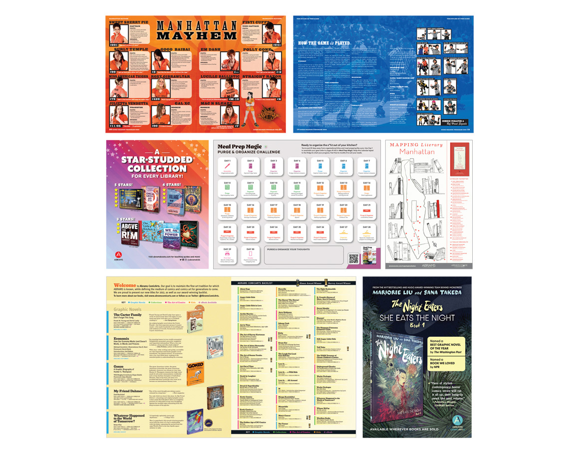
CHALLENGE: “Design a marketing piece for ABRAMS COMICARTS that showcases our complete title list (front to back) with detailed descriptions and specs – and make it fit on one piece of paper.”
CHALLENGE ACCEPTED: Using a font known for its legibility in tight spaces, I designed a tri-fold brochure with
front list titles on two pages;
recently published books on a single page,
and the back list on a fourth
then photographed and composited the complete ABRAMS COMICARTS catalog spine out as a family.
recently published books on a single page,
and the back list on a fourth
then photographed and composited the complete ABRAMS COMICARTS catalog spine out as a family.
The cover featured interior illustrations from a front list title, The Carter Family,and I used color coding to identity each book’s by genre, to save even more space.
